A Fresh Coat

Boys Bedrooms

Wolf Den

Boys BedroomsJenny SulpizioComment

Hey, remember that Superhero bedroom I completed not too long ago? You know—the one with that crazy fun cityscape wall mural? Well, little “E’s” big brother , “M” needed his room made over as well.

His interests? Wolves and Kobe Bryant.

Now, this is why I LOVE decorating and why designing rooms is seriously so much fun! Each one presents its own challenges—and it’s these challenges that I LOVE working through and figuring out…like how to get Kobe and wolves to work together in one space.

As I’ve mentioned (ad nauseum), it’s important not to overdo a theme, yet implement interests in subtle ways without going overboard.

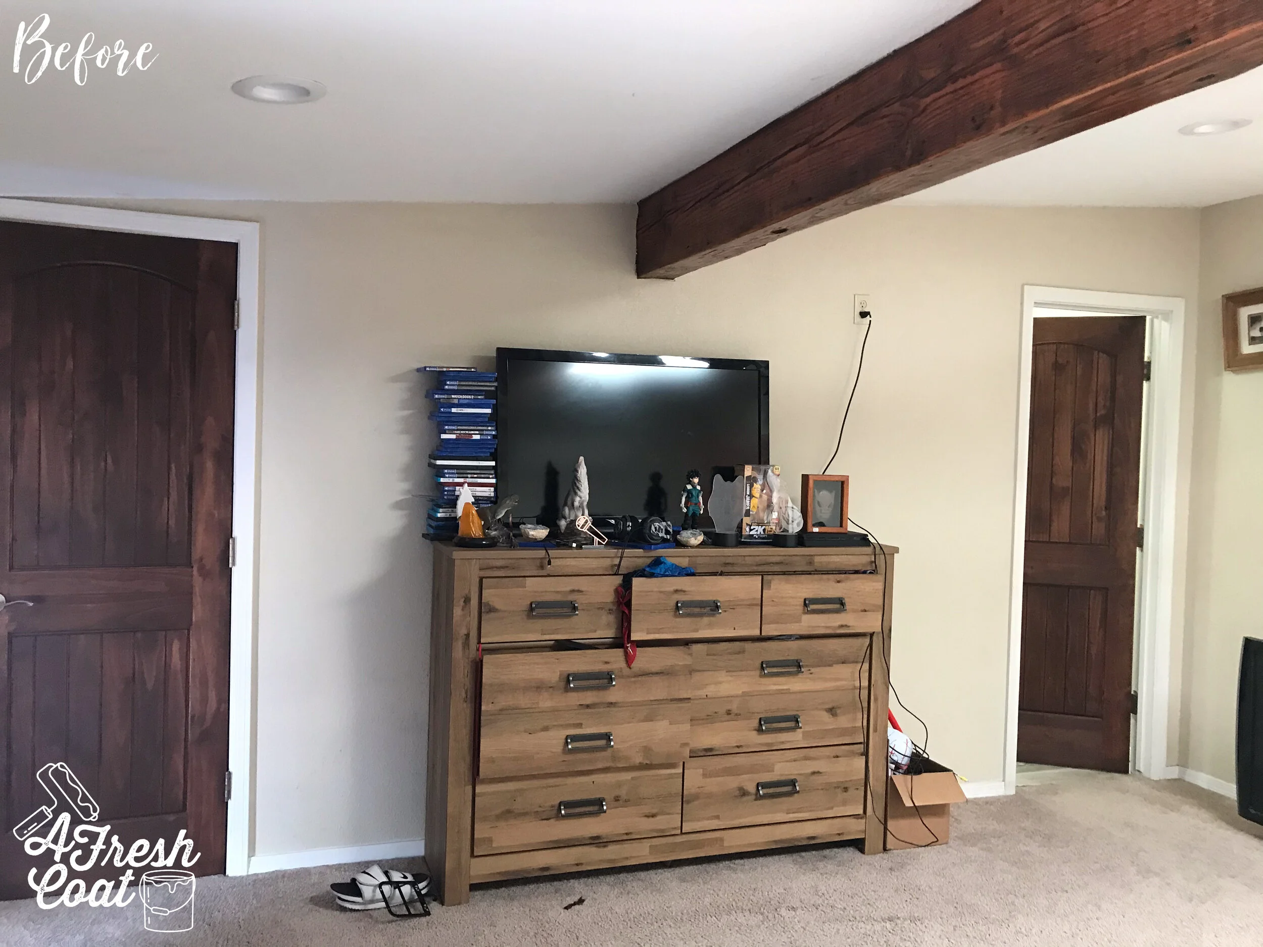
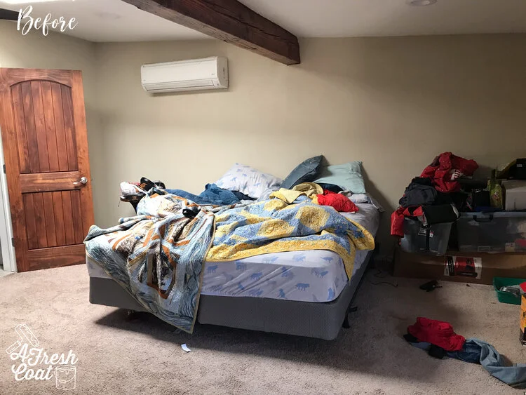
Here is where we started.

Wolf Den 1.jpg

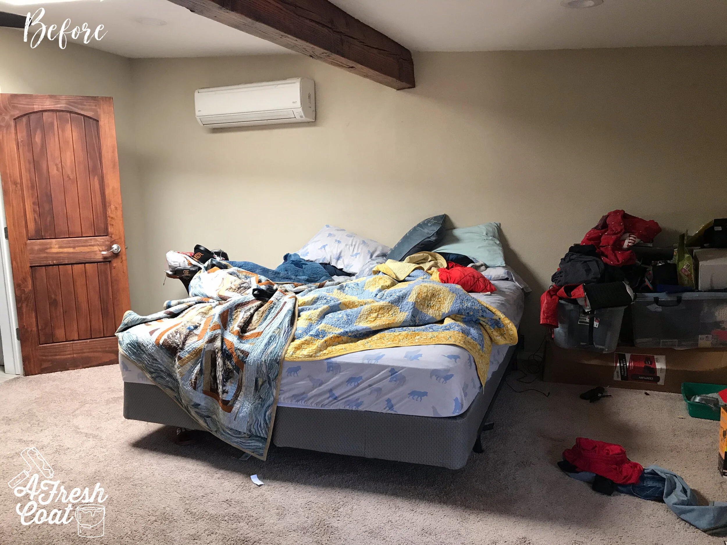
Disclaimer: I often capture “before” pics in the midst of chaos…like during the teenage years. Such is the case. It was clear that “M” needed more storage, and some digs that were not only fun, but also age appropriate.

Wolf Den 2.jpg

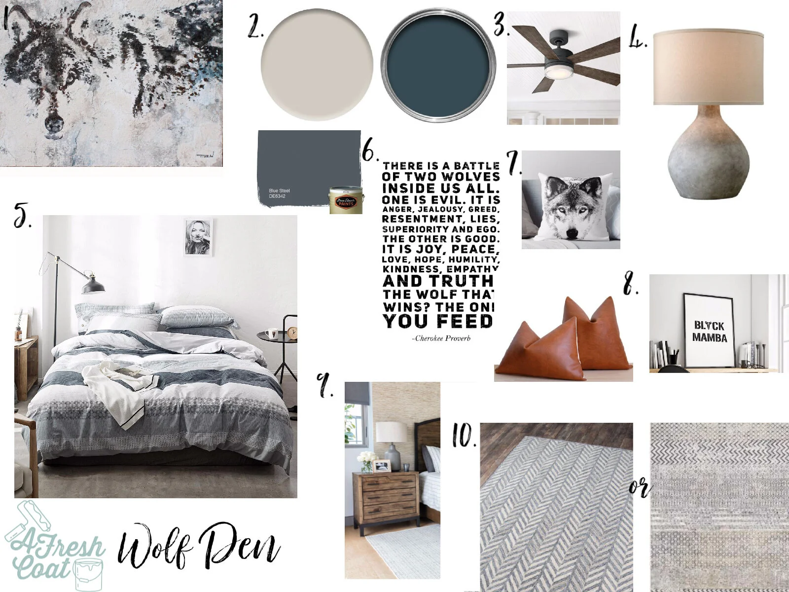
After walking through this space one word hit my brain: potential. With those would beams and beautiful doors, this space had promise. It just needed to be revamped is all. After our consultation, I immediately returned home and whipped up this vision board.

Wolf Den.jpg

“M” is sixteen so I wanted his room to feel masculine and adult-like… but not too adult-like. I wanted to incorporate his love of wolves but do so in an understated way.

First up? Paint.

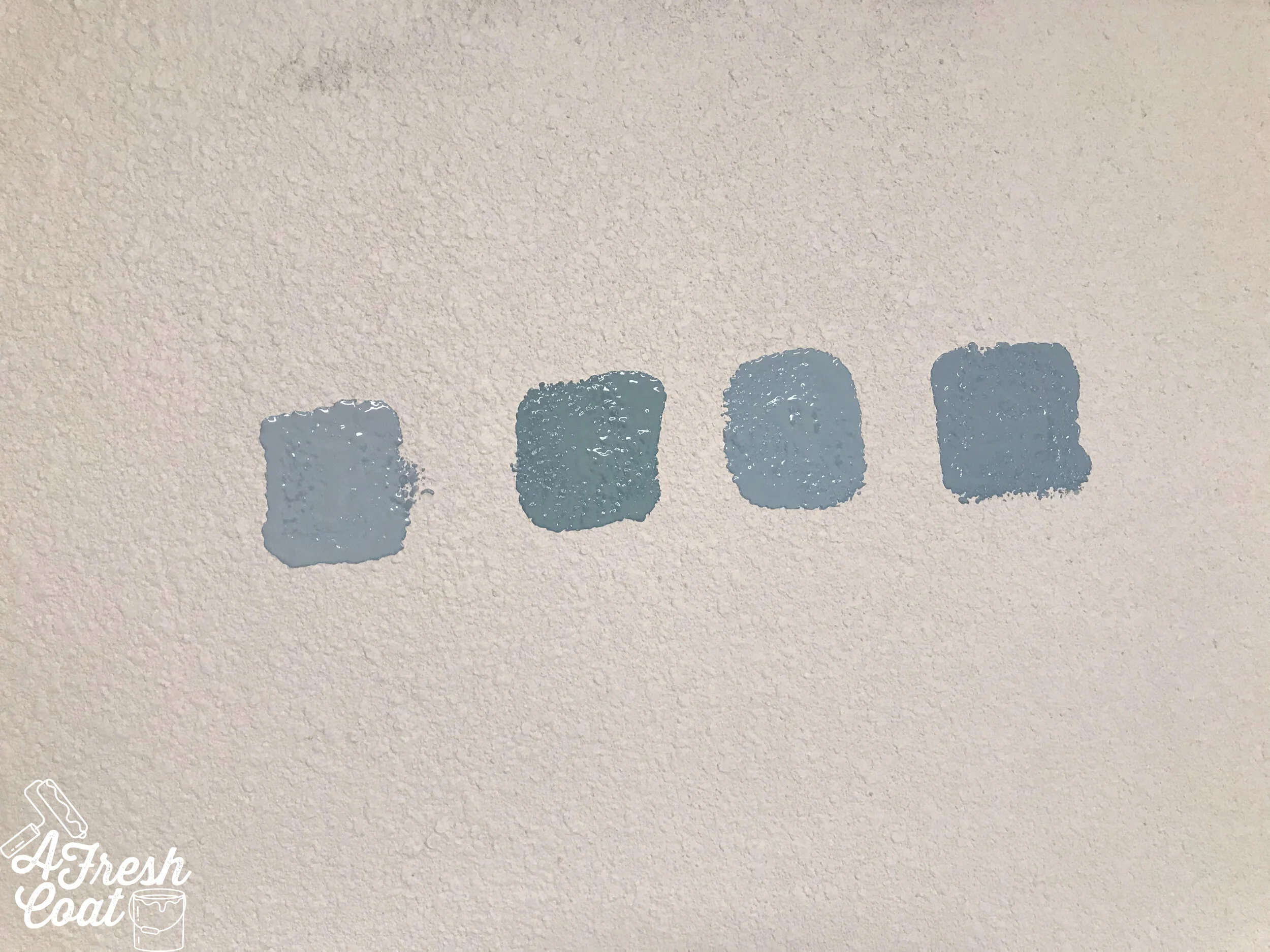
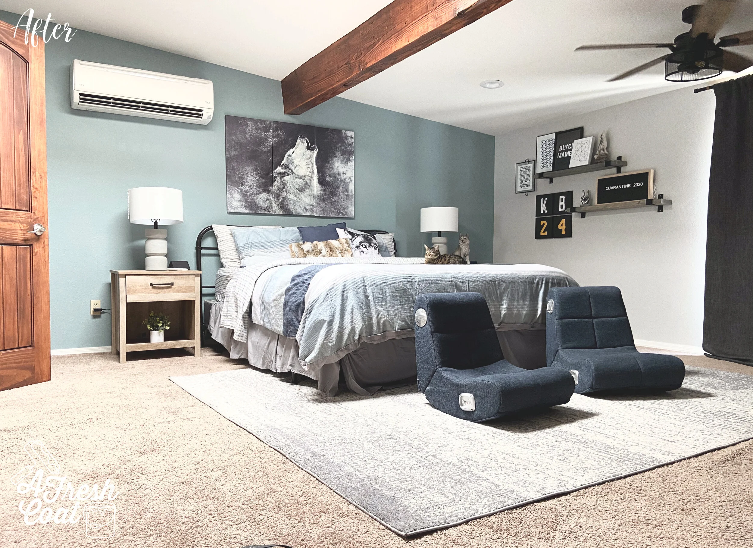
After placing the color samples up, SW Delft (with a 20% reduction in color), was selected for the accent wall. That would be sample #3 (read L-R) up above. The three remaining walls were then finished in SW Drift of Mist (with a 20% reduction).

Wolf Den 6.jpg

Paint always changes the entire vibe of the room. Always. It’s an immediate facelift.

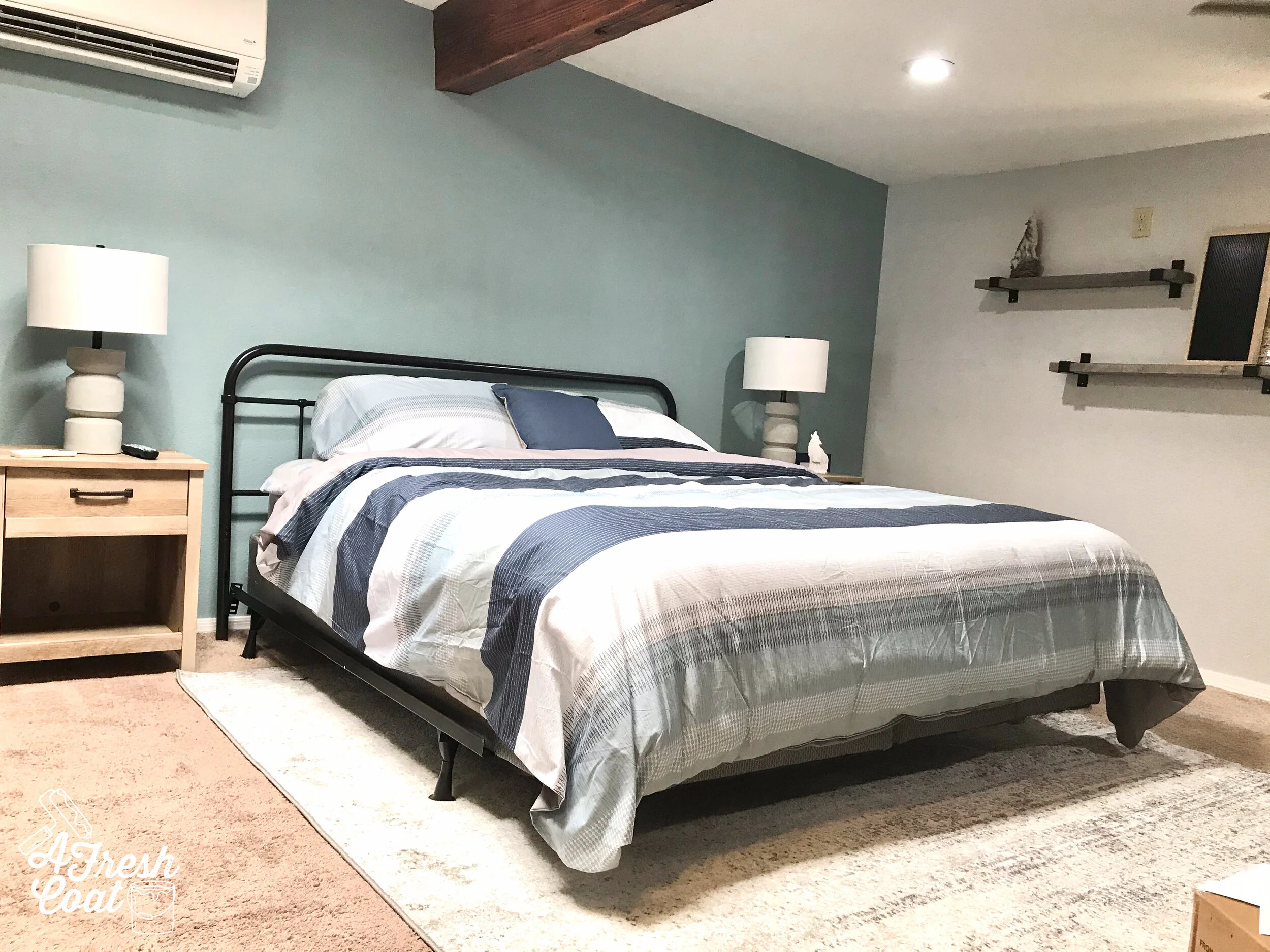
AFC then brought in a new metal headboard, matching nighstands with concrete finished lamps, new shelving, and a large area rug.

Ready for the reveal?

Wolf Den 7.jpg

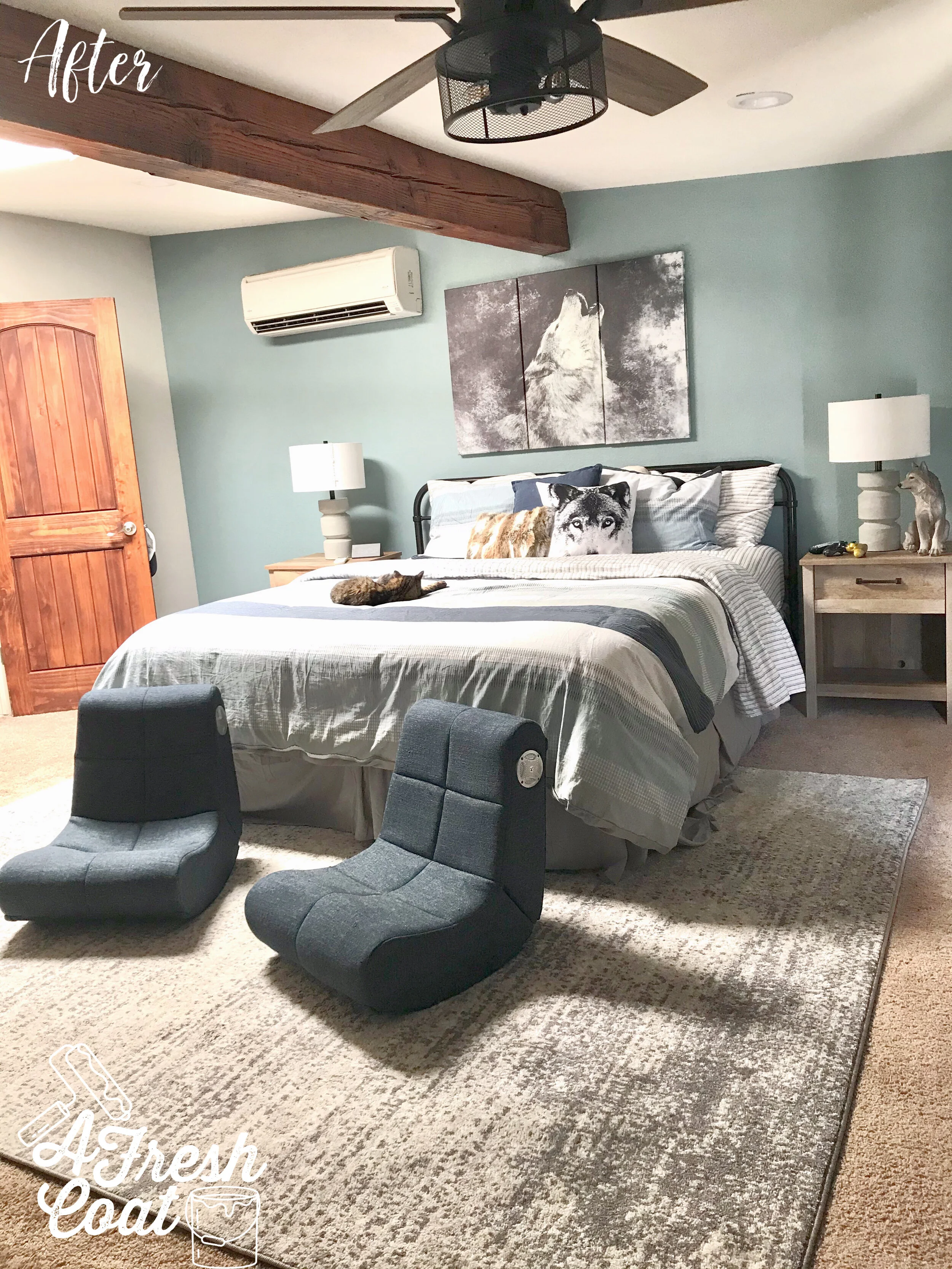
Here it is you guys!

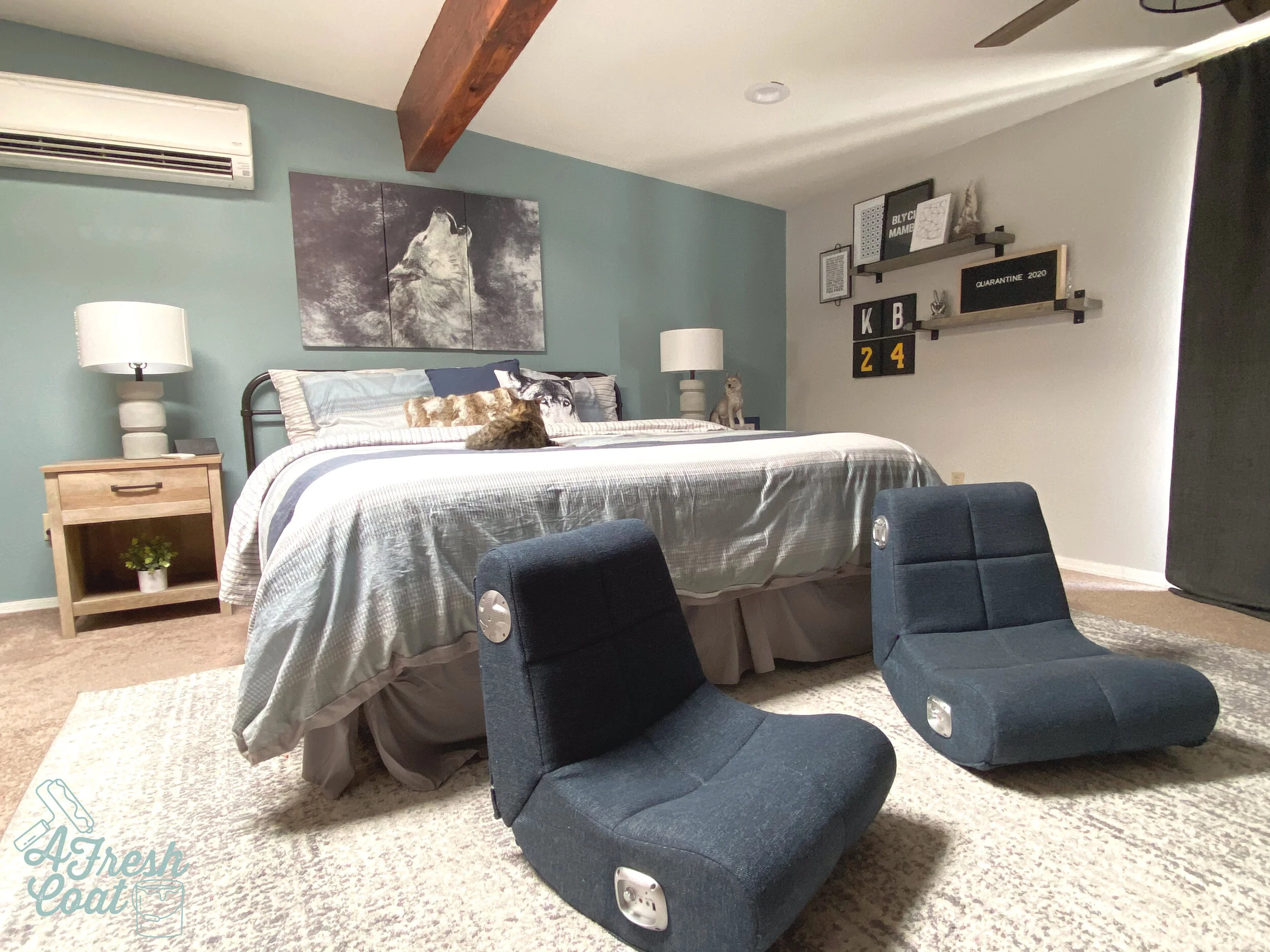
I’m really loving how it turned out and better yet, so is “M.” A gamer, he needed some additional seating in his room and Pottery Barn Teen just happened to have these exact gaming chairs, in the color I needed, on sale. Love that.

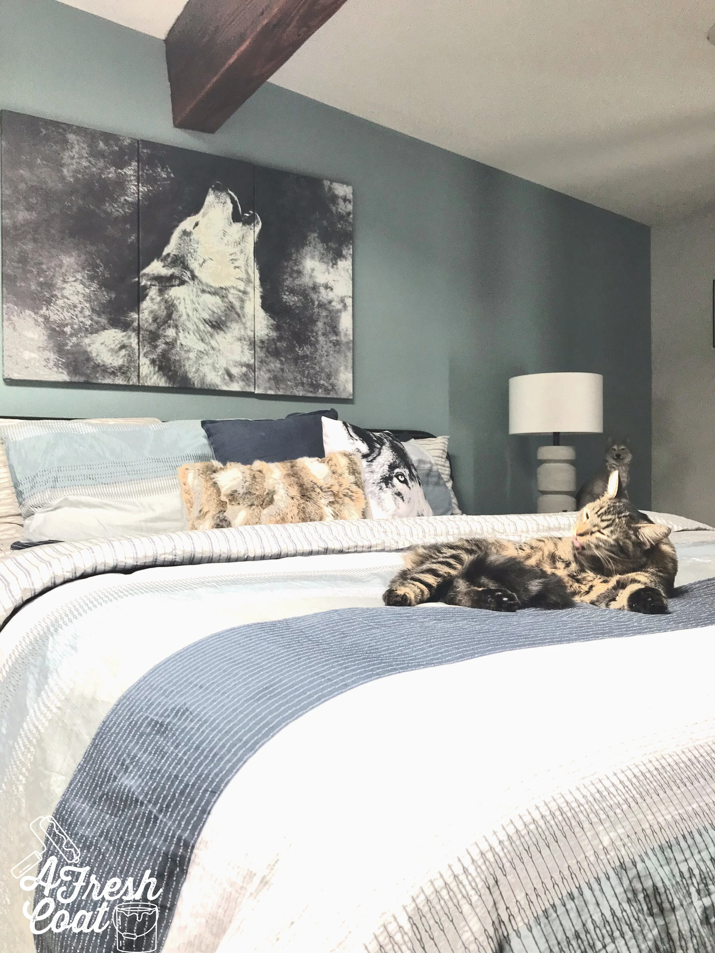
The tryptich was purchased on Etsy and sent all the way from Turkey. After making its way through customs (a month long process), it was placed front and center on that beautiful accent wall.

Throw pillows were brought in (not too many—it’s dude code), and new ceiling fans were added. Funny thing, this area originally only had one ceiling fan since it was converted from an Arizona room to a bedroom. But the space looked off so we added another fan equidistance apart from that amazing rustic, wood beam.

Wolf Den 7 copy.jpg

Apparently kitty loves this space too after photobombing every pic.

Wolf Den 5.jpg

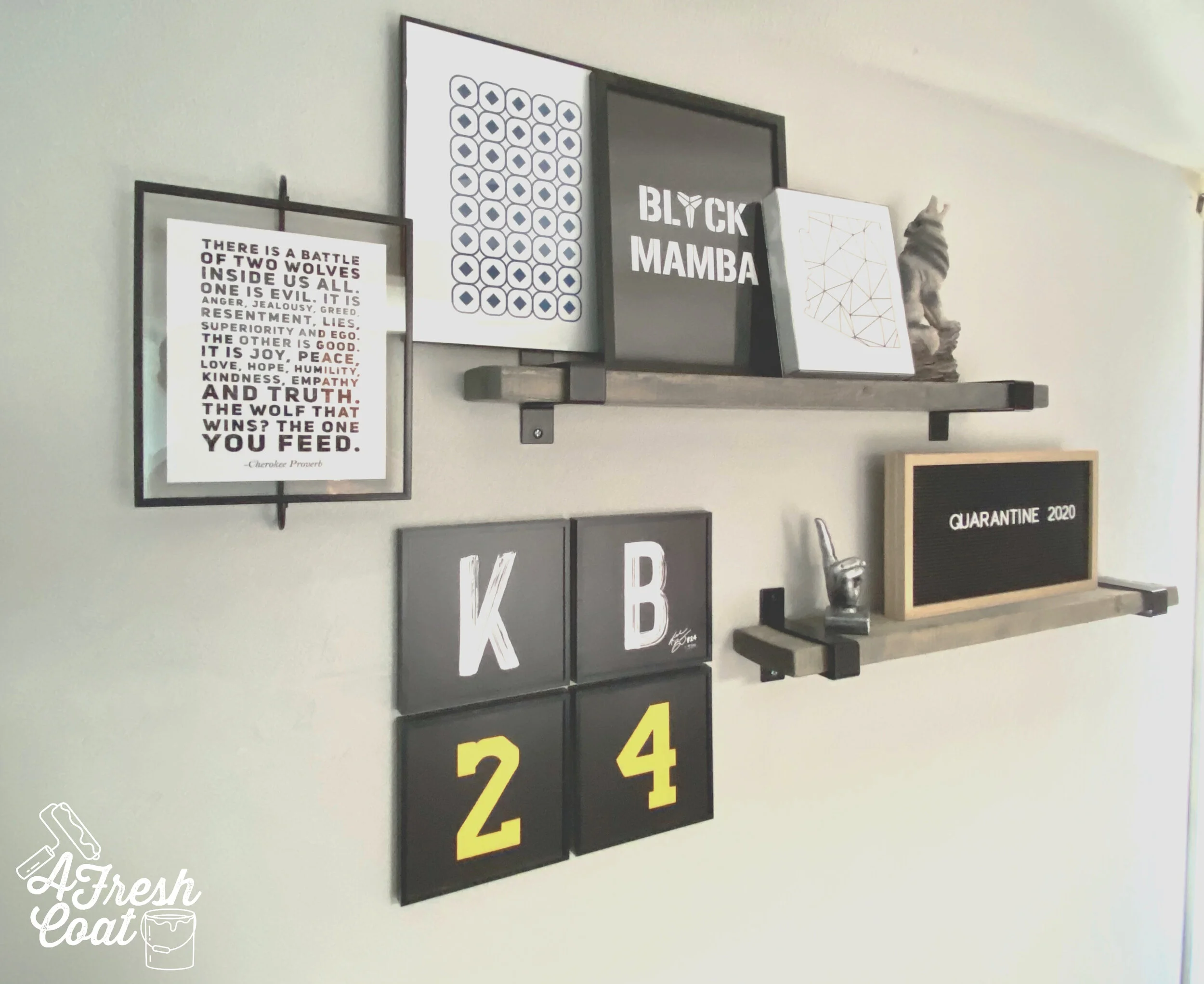
Remember, “M” also loved Kobe and the best way to incorporate him into this space (without bringing in the Lakers infamous yellow and purple), was to add his number, initials, and nickname instead. A few more pieces and this wall was D-O-N-E!

Wolf Den 9.jpg

New charcoal grey blackout panels were also added to the room, and it was finally finished.

Here’s one more before and after.

Wolf+Den+1.jpg
Wolf Den 8.jpg

THE DETAILS:

Paint: SW Delft (accent wall), SW Drift of Mist

Paint Labor: A Fresh Coat Yuma

Nightstands: Wayfair

Headboard: Wayfair

Gaming Chairs: Pottery Barn Teen

Rug: (8x10): Overstock

Lamps: Overstock

Wolf Tryptich: Etsy

KB24 Tiles: Mixtiles

Peace Figurine: Amazon

Bedding: Amazon

Shelving Units: Overstock

Ceiling Fans: Amazon

Wall Art (Printables): Etsy

Love, J

So, what do you think? What interests do your teenage boys have that you want to incorporate into their rooms?

Marvel Madness

Boys BedroomsJenny Sulpizio2 Comments

This is one of those projects—-the kind I get so excited about I can hardly wait to reveal it to you guys. The type of project where I’ve been given complete creative liberty and the green light to do whatever I want.

Yes, you read that right…WHATEVER I WANT!

Projects like these are rare (and I understand why), but when they happen, I just can’t contain my excitement.

Plus, I LOVE kids rooms and am totally in my element when working with a theme.

It. Is. The. Most. Fun.

Like, ever.

Ok, enough babbling already. Here we go. This is where we started, friends:

Marvel Madness 2.jpg
Marvel Madness 1.jpg

“E” loves Avengers and his mama wanted to give him a room that screamed ‘em from the ceiling to the floor. Of course I was happy to oblige and wanted to do something a little different…like wall mural type of different.

In the process of searching, my inspiration came into focus after locating this amazing wallpaper mural from Rebel Walls.

Rebel Walls

Now, this isn’t for everybody but I so dig the city vibe it gives off. Not only that, but this can in fact grow with this kiddo well into his teens, which means my client is getting the biggest bang (pow, splat, and kerplunk) for her buck. Get it?! LOL!

As always, it starts with a vision board and this one was packed full of color.

Superhero Bedroom.jpg

So even though this kiddo has yet to hit double digits, the items presented and purchased in this room will give him years of joy. And those he grows out of (namely throw pillows and a few art pieces), can be replaced by something else.

Those of you who follow me on Instagram might have seen me having way too much fun on a semi-recent trip to the Pottery Barn Oulet up in Phoenix. I scored a number of pieces for this room there and the rest were located online.

Okay, so let’s get to the details of this space. Here’s how it went down.

The first thing that had to be addressed was the wallpaper. Here in AZ we mostly have textured walls. Textured walls and wallpaper (for the most part) do not mix which means this wall had to be skim coated and then wallpapered. Thanks to Ramon Navaratte and his crew, this got done in no time at all.

Marvel Madness 4.jpg

I can’t stand it. Ready for the “after” pics followed by all the details?

Marvel Madness 3.jpg
Marvel Madness 12.jpg

I mean, I can’t even. I just love how this room came together…and all that color balanced with those neutrals. It’s just F-U-N!

Let’s chat about the paint first.

This room doesn’t get a lot of natural light because the curtains are usually drawn tight (hey—that rhymed!), so I wanted to make sure the wall color I was using was light and bright. I opted for Sherwin William’s Crushed Ice. With just a hint of grey, it really did brighten up the room and allowed that wall mural to pop. We took that dingy 90’s yellow and reworked it!

Now this is where the fun began. After buying striped grey bedding and basic grey draperies, color was brought in everywhere else. From the rug, to the throw pillows, to the shelving, and everything inbetween. Superheroes are all about color and I wanted to give “E” tons of it.

Marvel Madness 6.jpg

This included a one of a kind, custom lampshade. I almost gave up hope on this one until I posted a plea to my Instagram followers and they came through. Clutch! I got the name of a pro tagger/artist who was amazing to work with and tagged this lampshade just for “E.”

Marvel Madness 13.jpg

Color was also introduced by means of framed artwork via Etsy. I always get most of my pieces from the fabulous creators on that site and this job was no different. Superhero sayings, a monogram, along with a few other prints, and the shelves were decked out.

Marvel Madness 5.jpg

Furniture was another issue that needed to be addressed and placement for this space was a bit of a challenge. It actually kept me up at night because I didn’t want to place the bed length-wise up against the windows because it always makes the draperies wonky. I didn’t want to place it up against the wallpaper as tyo help preserve it and not rub against it either. I also didn’t want to keep it as it was originally because that wasn’t ideal either. Long story short? The TV was moved across the room, the bed rearranged, and the dresser tucked away in the closet. The result? A more open space, additional room, and an area that works.

Marvel Madness 8.jpg
Marvel Madness 15.jpg
Marvel Madness 14.jpg

Let’s compare the before and after just one more time:

Marvel+Madness+2.jpg
Marvel Madness 16.jpg

THE DETAILS:

Paint: SW Crushed Ice

Paint Labor: A Fresh Coat Yuma

Duvet Cover/Shams/Insert: Amazon

Avenger Sheet Set: Amazon

Green Coverlet: Pillowfort-Target

Throw Pillows: Amazon, IKEA, Pottery Barn Outlet, Zazzle

Nightstand: Wayfair

Rug: Wayfair

Shelving: Pottery Barn Outlet

Artwork and Frames: Target, Etsy. Amazon, Michaels

Lamp: Wayfair

Custom Lampshade: Dleys-Las Vegas

Clock: Amazon

Main St. Sign: Homegoods

Draperies: Pottery Barn Outlet

Drapery Rod: Amazon

Cubby Unit and Bins: Target

Toy Storage: Target

Wallpaper/Wall Mural: Rebel Walls


Love, J


Boy's BOHO Bedroom

Boys BedroomsJenny SulpizioComment

Boho. I love the feel of a Boho room. The simplicity of this style mixed with an “anything goes” kind of vibe is freeing when it comes to decorating and just plain living in said spaces. It’s awesome, actually. Even more so when it’s for a one of the sweetest (and smartest) little guy’s I know. “H” is preparing to become a big brother (verrrrry soon) which means he needs a space to call his own—a room just for him with a style that’s crazy cool.

“H’s” mom is also extremely cool herself and when we discussed the makeover of this space, she gave me creative freedom to design the entire thing. I love that.

Mrs. “M” found this amazing coverlet at Target and it quickly became the inspiration for this space.

Here is where we started:

Boys Boho Bedroom 1.jpg

Now, the entire home was painted in a beautiful shade of grey, but Mrs. “M” had grown tired of it and wanted something new…something fresh and so clean clean. Oh, and an accent wall. She definitely wanted “H” to have an interactive accent wall.

Boys Boho Bedroom 2.jpg

Can you guess what we did?

Boys Boho Bedroom 3.jpg

If you said “chalkboard wall,” you’re right!

Two quarts and three coats of this stuff and the walls were ready for our budding artist. Chalkboard paint can literally come in any color (ask your local paint store for options), but I’m digging the striking contrast this wall boasts (imagine that? ). Can you see where this room is headed? Just that one wall make such a difference already. Can’t wait for the rest.

Boys Boho Bedroom 4.jpg

Thes remaining walls were lightened and brightened using Valspar’s Dogwood Petals. C-O-N-T-R-A-S-T! Love it…and apparently “H” and his friends do too. Look at him go!

IMG_2410 2.jpg

Ok, ready for the “after” shots? I really love how this room turned out.

Boy's Boho Bedroom 1.jpg

And look! You can see the bathroom from this view and all those little Swiss Crosses. #swoon.

Boy's Boho Bedroom 4.jpg

When it came to the opposite wall, a gallery of sayings, and beautiful BOHO art was in order. This shelf was such a great find, as were a number of the pieces found at Hobby Lobby, Target, and Etsy.

And look! You can see the playroom from this view, complete with more of those adorable Swiss Crosses. #doubleswoon.

Boy's Boho Bedroom 2.jpg

Here’s an up close (and not-too-personal) shot of those items.

EFFD030F-9D50-4AFD-9BE4-372D2C82B447 2.JPG

Needless to say this is definitely a room with a view…of the bathroom. Here’s another shot of these coordinating spaces. Oh, and ignore the bathroom vanity doors which are open and currently drying. That bathroom is coming to the blog soon once I put the finishing touches on it.

Boy's Boho Bedroom 3.jpg

One final view of this madeover space. I so dig it.

Boy's Boho Bedroom 1.jpg

THE DETAILS

Paint: Valspar’s Dogwood Petals and Rustoleum’s Chalkboard Paint

Paint Labor: A Fresh Coat Yuma

Coverlet: Target

Bedding(Sheets): Amazon

Artwork: Etsy

Rug: Amazon

Decor: Dandy Home & Ranch, Hobby Lobby, and Target

Shelf: Wayfair

Rug: Amazon

Love, J